Issue #8 - Support Vector Machines Simplified
With the bites of SQL's killer commands, Python's powerful methods, and how to display percentages
Hey everyone! This is Josep, one more week 👋🏻
Today we have a new issue plenty of stuff 💥
Support Vector Machines 📐
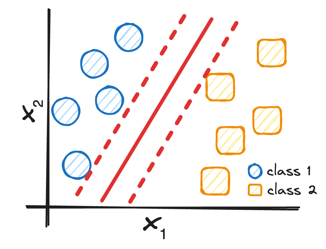
Support Vector Machines (or SVM for friends) emerge as a robust ML algorithm that classifies any dataset into distinct categories.
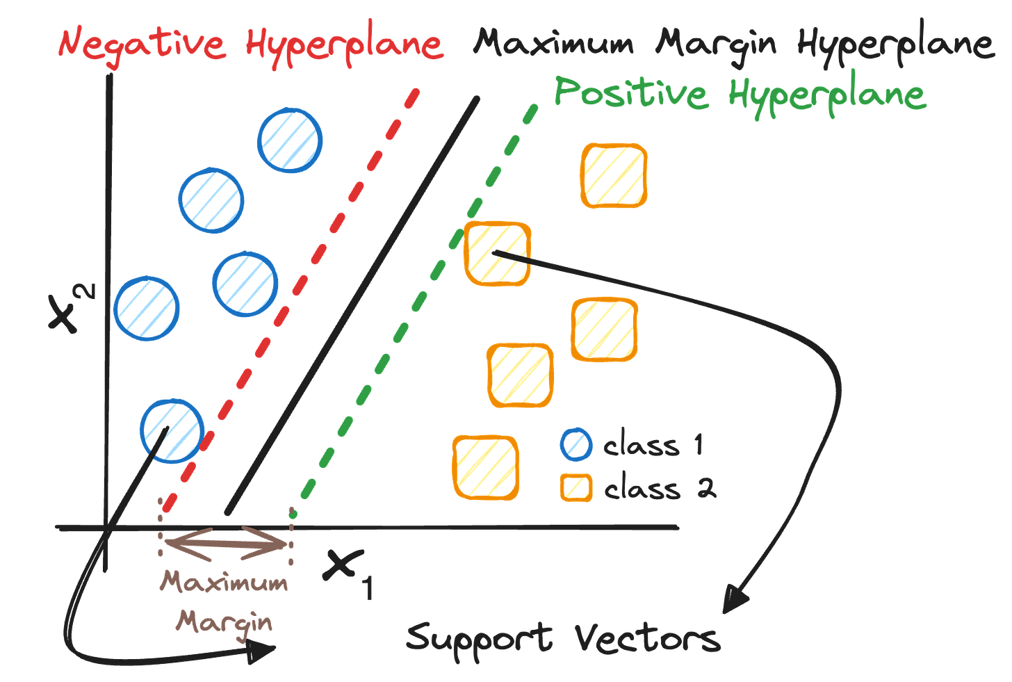
The main objective of SVM is to find the optimal hyperplane or boundary that splits our data set into two different classes. So before starting, we need to define three main concepts:
Support Vectors: The points that are closest to the hyperplane.
Margin: The distance between the hyperplane and the Support Vectors.
Hyperplane: The decision-making boundary.
⚠️ In two dimensions, it is a line. In three dimensions, it is a plane.
So now that we already know the main concepts of SVM…
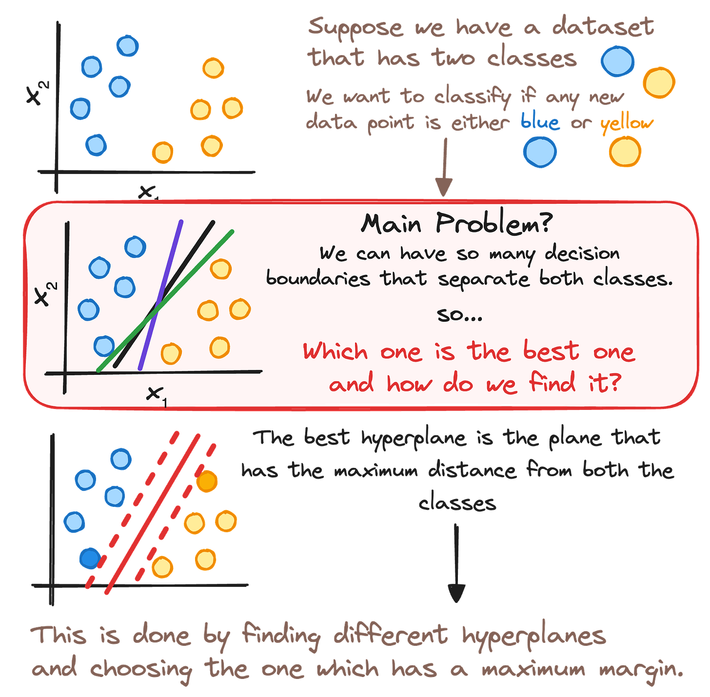
How can we define this optimal boundary?
The main logic behind this definition is to maximize the margin between both classes. To find it, we "simply" choose the hyperplane that presents the highest distance with both support vectors.
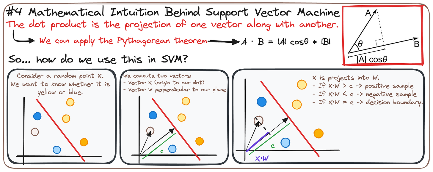
There’s some mathematical intuition behind this model:
The dot product is the projection of one vector along with another. So we can use it to determine whether a data point is one class or the other.is some basic linear algebra.
If we consider a random point X, we can easily classify it taking advantage of the dot product.
• If X·W > c -> positive sample
• If X·W < c -> negative sample
• If X·W = c -> decision boundary.
If you want to understand more about SVM, you can go check my cheatsheet!
🧩 Weekly Bites
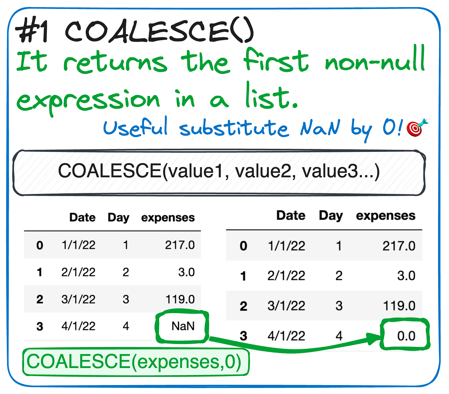
#1.SQL's killer commands-FROM RAW TO CLEAN DATA ⚙️
Imagine you're a data detective and you've just stumbled upon a scene with some missing clues (null values) and you need to piece together the storyline (data trends).
Enter your SQL sidekicks:
COALESCE()is like a smart buddy that quickly fills in the blanks with zeroes, so there are no gaps in your data story.
LAG()is the wise old sage that can look back in time (previous rows) and tell you how things changed from one data point to the next.
Armed with these commands, you'll turn a jumbled data plot into a clean, coherent narrative, ready to crack the case wide open! 🕵️♂️📊✨
If you prefer a cheatsheet, just go get it!
#2.Python powerful methods-MAKE SENSE OUT OF DATA📈
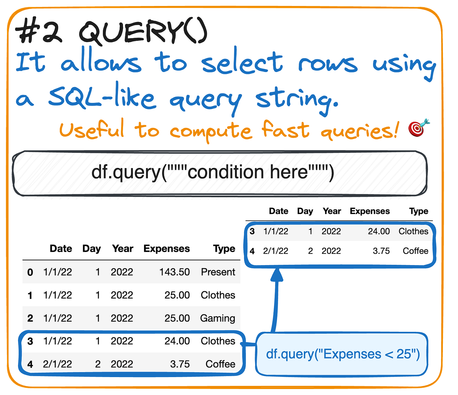
Drowning in data and not sure how to deal with it? Let’s learn together the killer .query() command.
Do you need to filter data based on certain conditions?
.query() is here to rescue! This function selects rows using a SQL-like query string, helping you dive deep into specific data aspects.
If you prefer a cheatsheet, just go get it!
#3. Alchemy of Data Viz - How to display percetanges! 🎨📊
Are you the one deciding how to display the data? Then you must ALWAYS keep your audience in mind
When creating dashboards, they will be used by people who are not used to working with data.
So the main objective is to facilitate the understanding of the data.
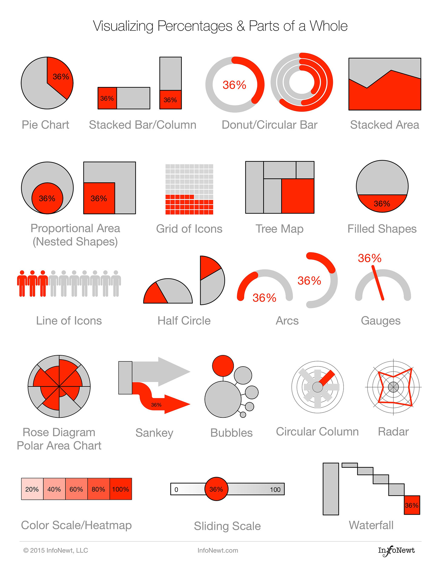
Did you know that using percentage graphs instead of tables can significantly boost your audience's comprehension?
𝗜𝘁 𝗶𝘀 𝗯𝗲𝗰𝗮𝘂𝘀𝗲 𝘃𝗶𝘀𝘂𝗮𝗹𝗶𝘇𝗮𝘁𝗶𝗼𝗻𝘀 𝘀𝗽𝗲𝗮𝗸 𝗹𝗼𝘂𝗱𝗲𝗿 𝘁𝗵𝗮𝗻 𝗻𝘂𝗺𝗯𝗲𝗿𝘀
Percentages are common data elements we deal with. But finding fresh, engaging ways to visualize these percentages can be a real challenge in data visualization.
This is why innovation matters!
𝘚𝘵𝘦𝘱𝘱𝘪𝘯𝘨 𝘢𝘸𝘢𝘺 𝘧𝘳𝘰𝘮 𝘤𝘰𝘯𝘷𝘦𝘯𝘵𝘪𝘰𝘯𝘢𝘭 𝘱𝘳𝘦𝘴𝘦𝘯𝘵𝘢𝘵𝘪𝘰𝘯 𝘮𝘦𝘵𝘩𝘰𝘥𝘴 𝘭𝘪𝘬𝘦 𝘱𝘪𝘦 𝘤𝘩𝘢𝘳𝘵𝘴 𝘪𝘴 𝘯𝘰 𝘦𝘢𝘴𝘺 𝘵𝘢𝘴𝘬. This is why, I attach 20 chart designs to display percentage data from InfoNewt.
And this is all for now!
If you have any suggestions or preferences, please comment below or message me through my social media!
Remember you can also find me in X, Threads, Medium and LinkedIn 🤓


