Issue #5 - Classifying Penguins in the wild
With the bites of SQL's execution order example, Python's killer commands and the types of data.
Hey everyone! This is Josep, one more week 👋🏻
Today we have a new issue plenty of stuff 💥
Logistic Regression in a Nutshell 🚀
Today's Data Bite is about exemplifying Logistic Regression.
We already know it is a classification algorithm to determine binary outcomes.
So here goes today’s challenge:
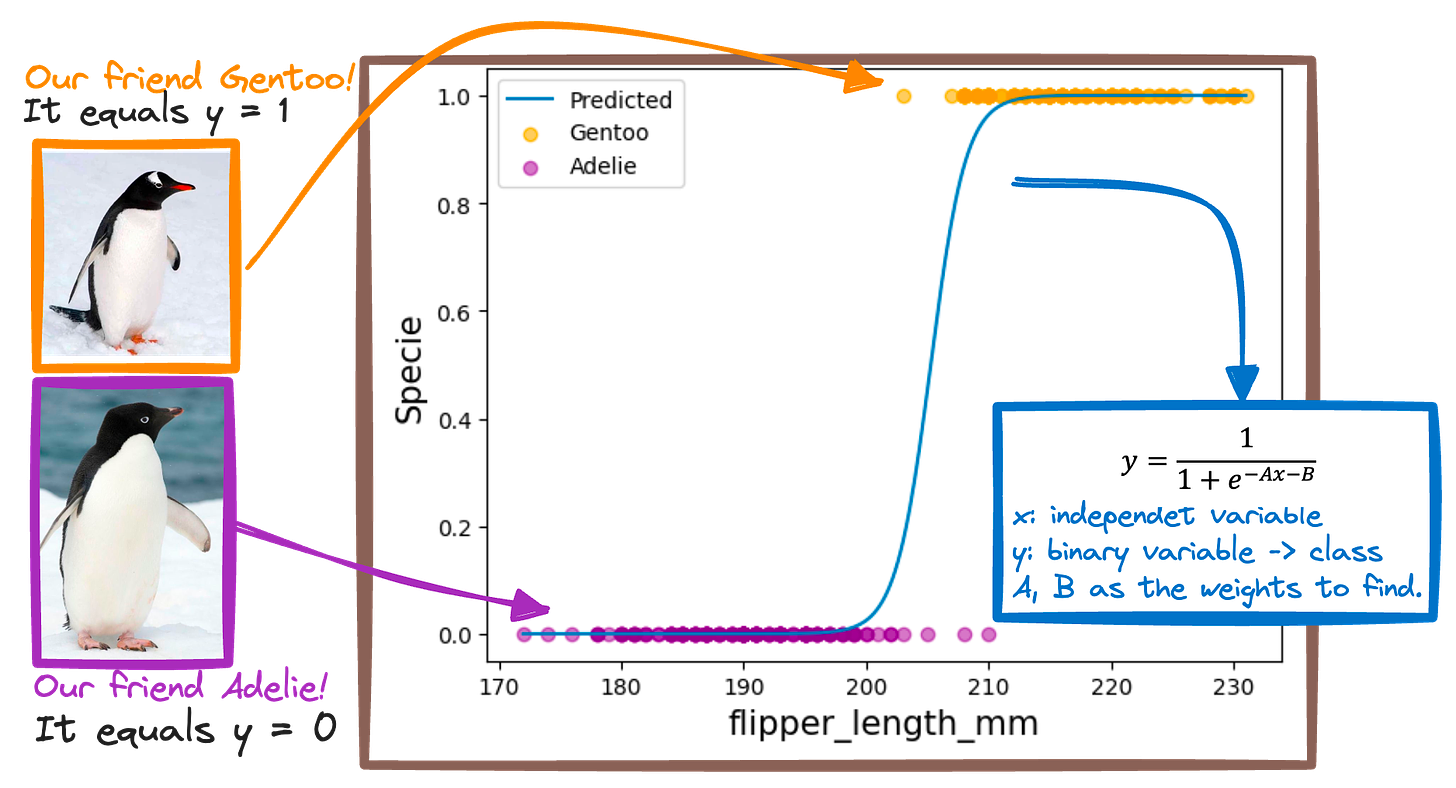
Learn to identify between two different penguins sepcies!
Gentoo 🐧
Adelie 🐧
So let’s imagine you're a detective identifying penguins just by looking at their flipper length.
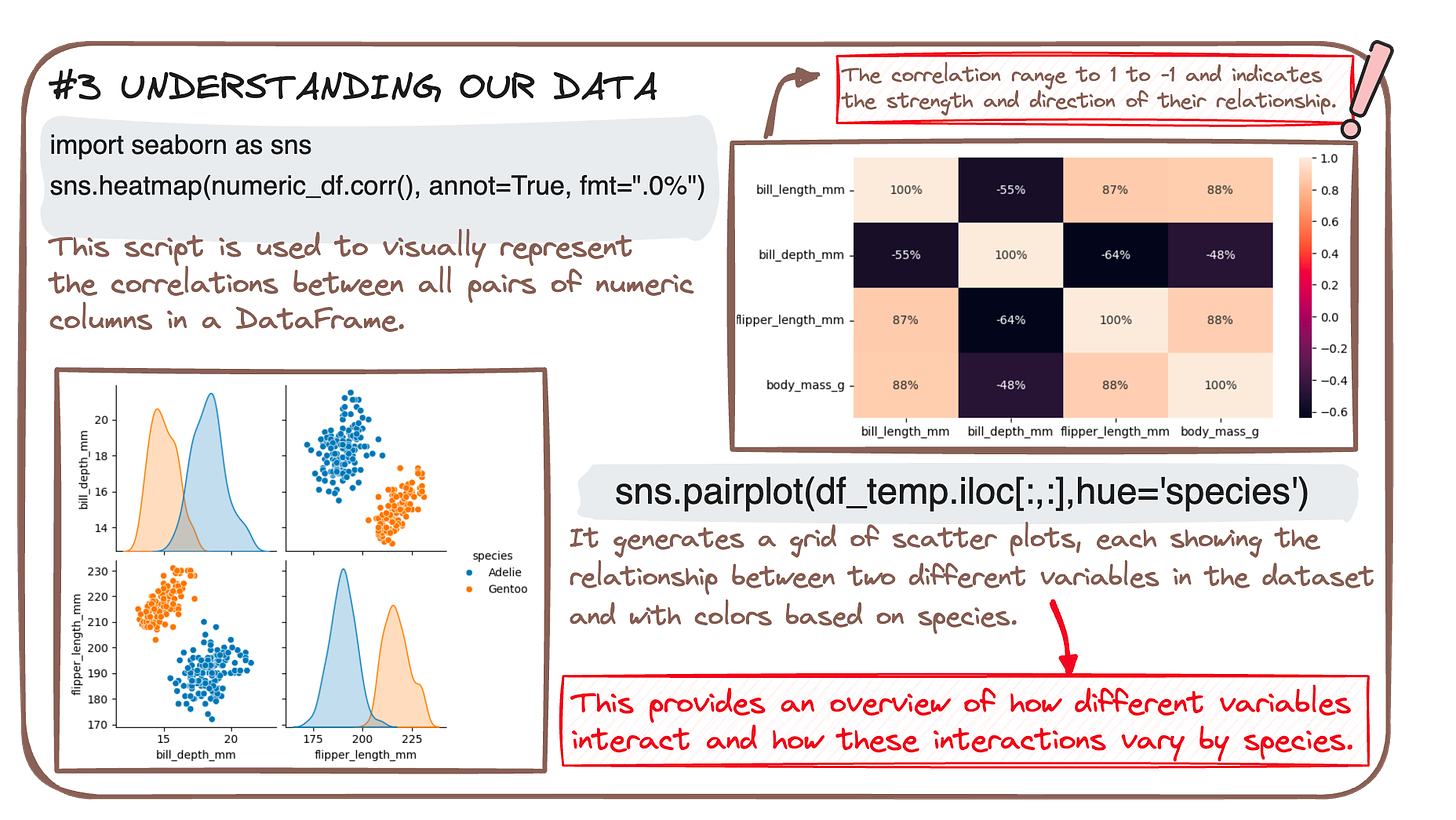
Logistic Regression is your trusty sidekick that helps you draw this line with just the right curve. So we first need to understand our data.
And once we know what variables to consider as our features, Logistic Regression helps us transform them to a prediction that tells us whether you're looking at an Adelie or a Gentoo penguin.
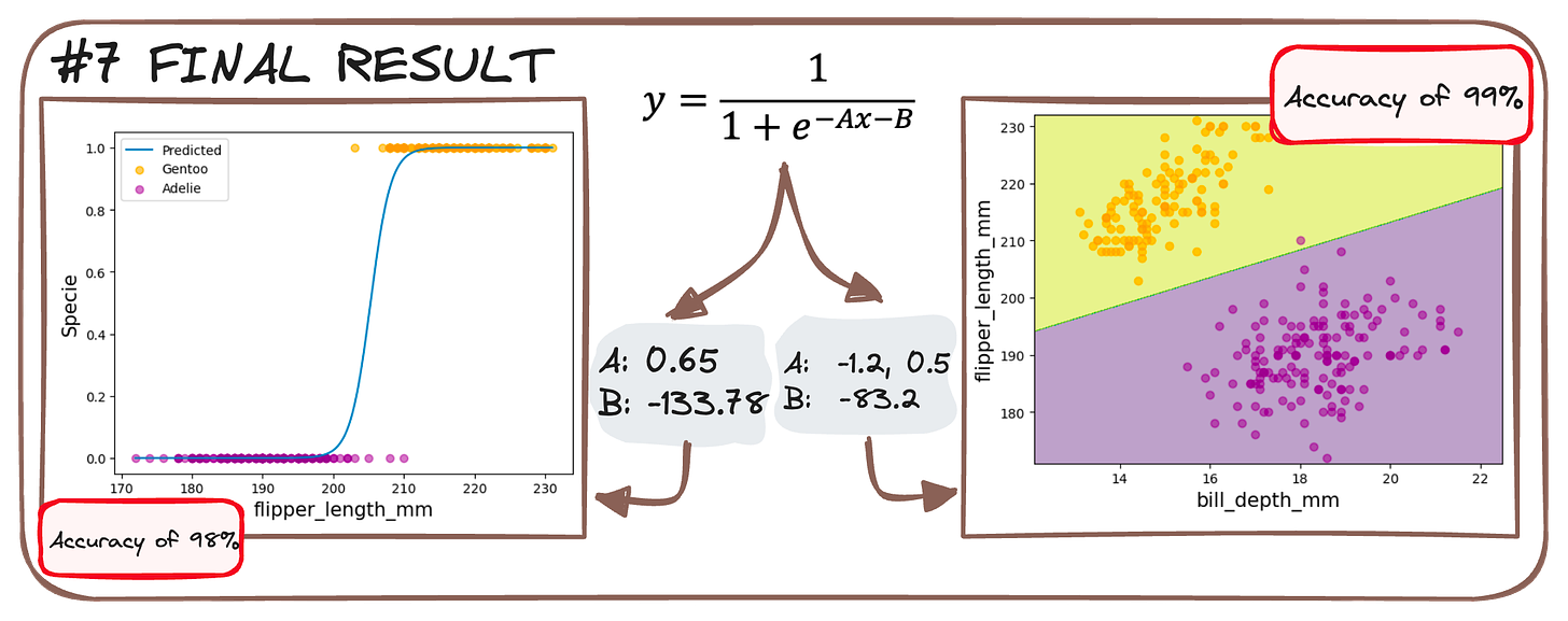
We train two models:
1 feature (flippery_length) to 2 classes.
2 features (flippery_length and bill_depth) to 2 classes.
It's like baking a pie – mix the right ingredients (data), heat (train the model), and voilà, you've got a pie that tells you "this flipper means Gentoo" with a confidence slice of 94%! 🐧🔍✨
You can check more about logistic regression in the following article.
Do you prefer getting one of my cheatsheets? Here you have it!
🧩 Weekly Bites
#1. SQL's Recipe for Data Delight - with different sources?🥘
Cooking up data with SQL is like following a recipe. However, what happens when we have multiple data sources?
We add our most beloved command - JOIN!
It allows us to generate a query that merges multiple tables information into a single one. So Imagine we have two tables:
And our goal is to understand the field that earns the most!
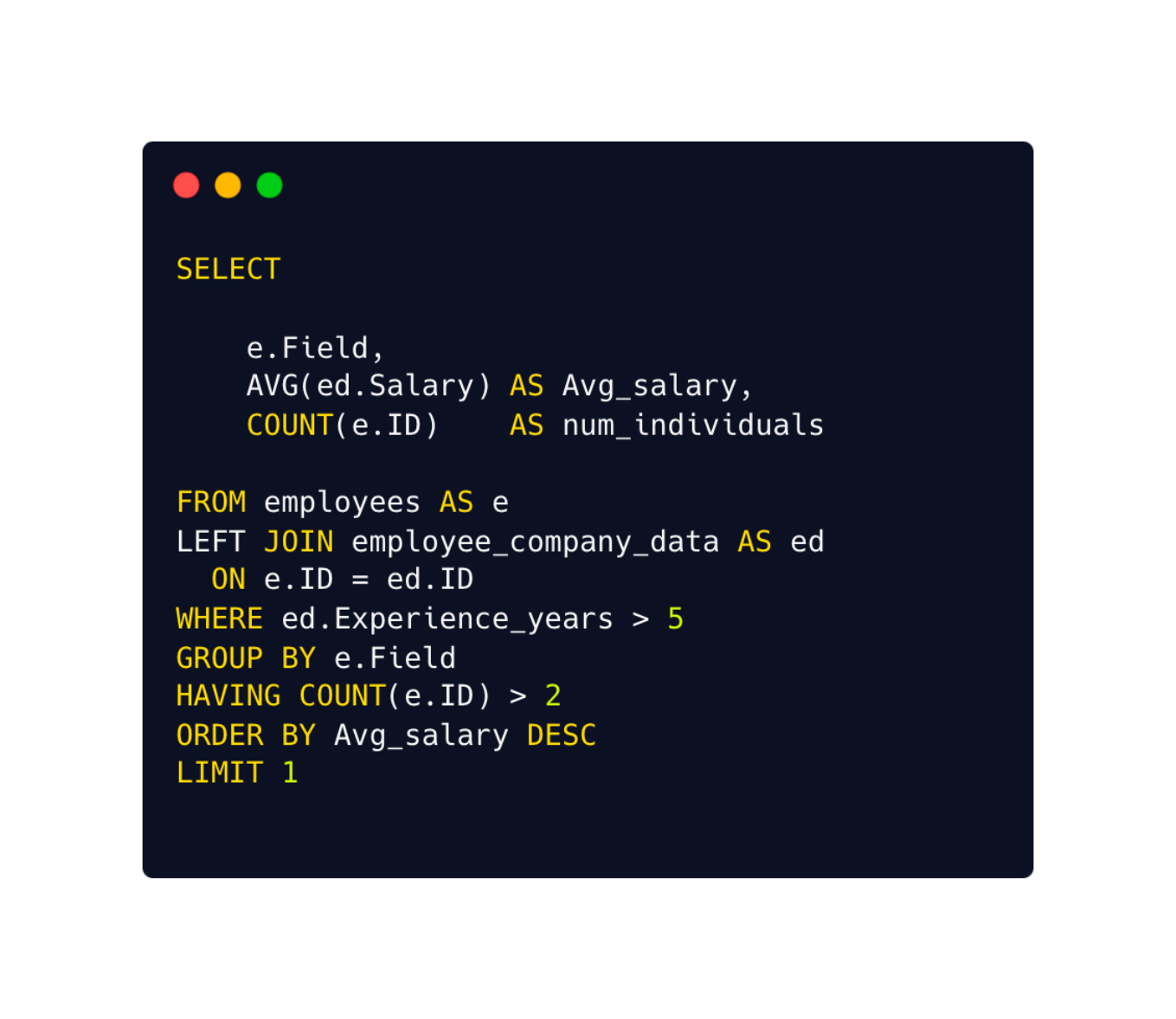
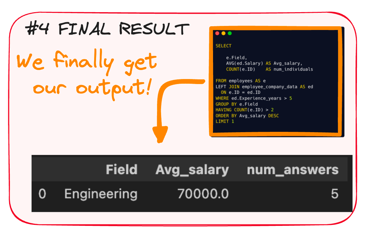
The query would look as follows:
Start merging both sources into a single query– that's your FROM and your JOIN
Then sprinkle in some WHERE to filter out the bits you don't need.
Next, stir in GROUP BY to lump similar data together - in our case by field!
Add a pinch of HAVING, keeping only the groups that fulfill your constraint.
Now, with SELECT, grab the required data - for us the field and the salary.
ORDER BY to arrange it neatly on your plate.
And LIMIT to limit our results.
And that’s it! Here we have our final result.
You can further understand SQL’s execution order in the following article.
If you prefer a cheatsheet, just go get it!
#2. Python’s killer commands to make sense out of data
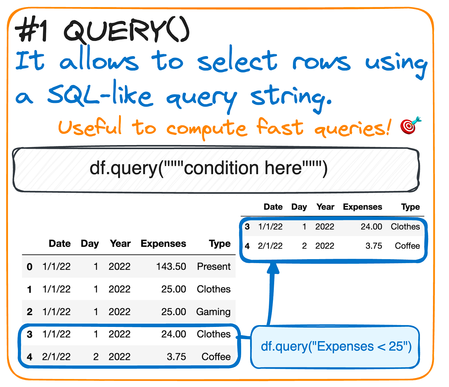
Query():Need to filter data based on certain conditions?
The query() method is here to rescue!
This function selects rows using a SQL-like query string, helping you dive deep into specific data aspects.
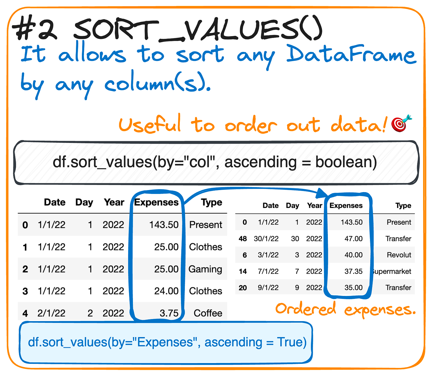
Sort_values()Keep your data tidy and organized with the sort_values() method.
Sort your DataFrame by one or multiple columns.
It’s like putting your data on a neat shelf!
#3. Charting the Essence of Charts 🎨📊
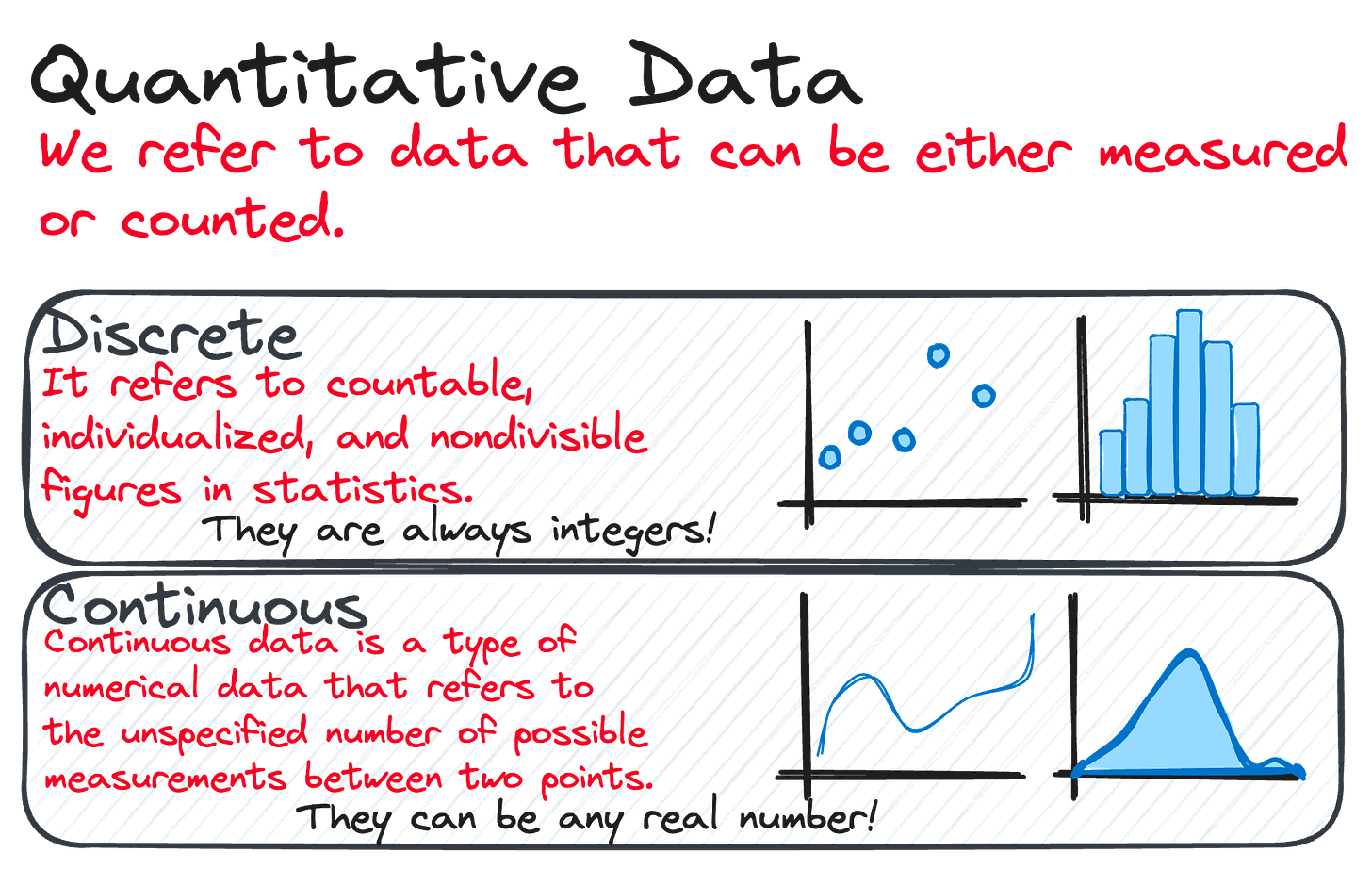
Imagine data as tiny dots of paint. Quantitative data is like a precise ruler, measuring and counting to create perfect lines. We've got two types:
Quantitative data is like dots on a dice, countable and neat, while Continuous data flows like a river, smooth and unending.
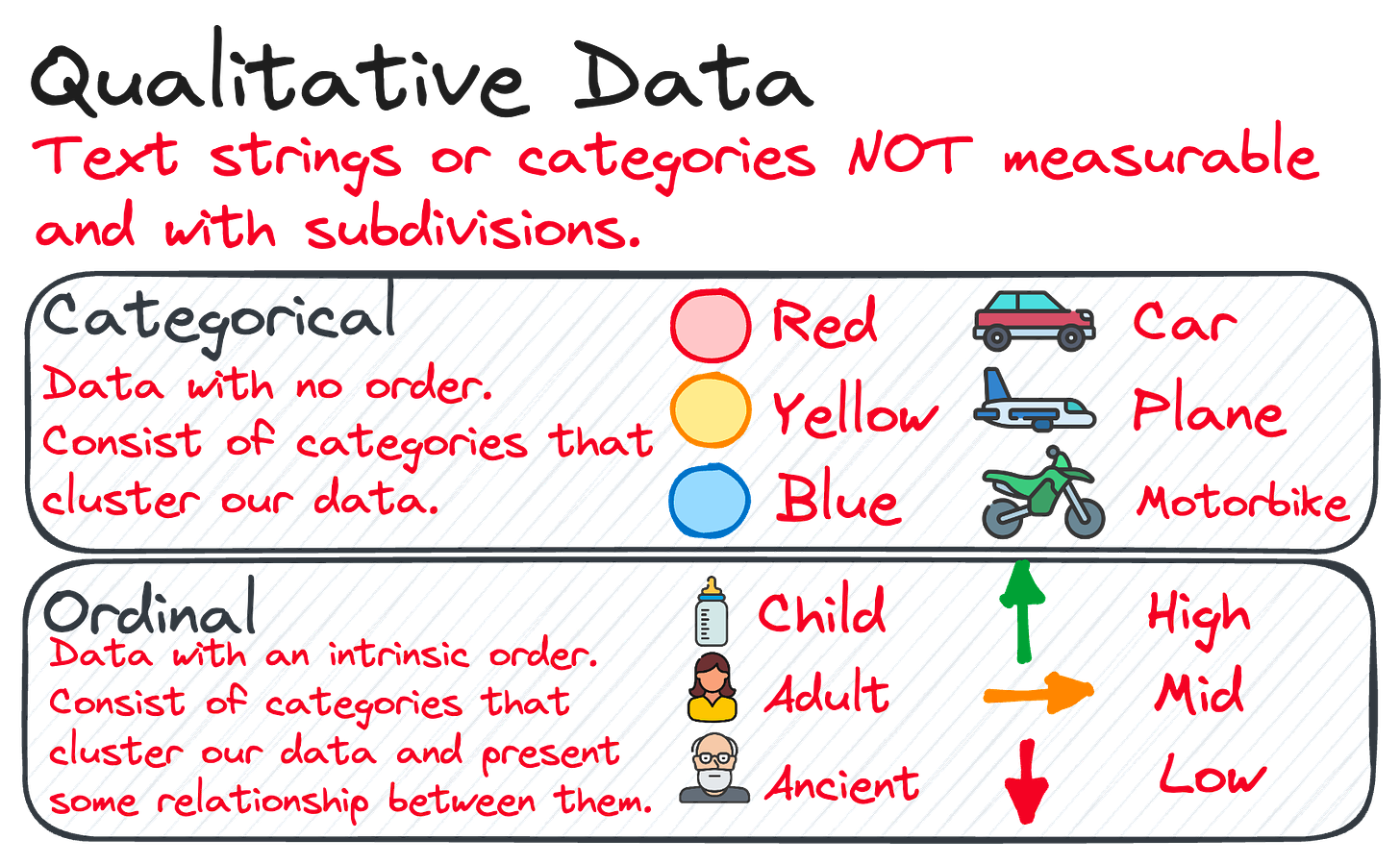
Qualitative data, the bold splashes of color that categorize and describe, adding depth and context to our masterpiece.
Together, they make a visual symphony, turning numbers and facts into a vivid story that pops off the canvas and into understanding! 🌟📈
You can check how to implement this in the following article.
Do you prefer getting one of my cheatsheets? Here you have it!
And this is all for now!
If you have any suggestions or preferences, please comment below or message me through my social media!
Remember you can also find me in X, Threads, Medium and LinkedIn 🤓


