Issue #4 - Logistic Regression in a Nutshell
With the bites of SQL's execution order example, Python Structure and the concept of a chart
Hey everyone! This is Josep, one more week 👋🏻
Today we have a new issue plenty of stuff 💥
Logistic Regression in a Nutshell 🚀
Imagine teaching a robot to tell apples from oranges just by looking at them.
That's logistic regression in data science!
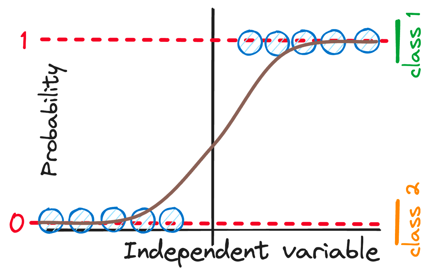
It's like a light switch, flipping your data into "Yes/No" answers.
By squishing numbers through a magical math slide called the sigmoid function, logistic regression predicts which category, or "class," things belong to.
How do we get the logistic regression formula, you ask?
It is based on the linear regression theory we already learnt!
To transform our linear guess into a winning bet, we slide our predictions through a magic curve called the sigmoid. It's like a playground slide that turns any number into a chance of winning between 0 and 1.
You can check more about logistic regression in the following article.
Do you prefer getting one of my cheatsheets? Here you have it!
🧩 Weekly Bites
#1. SQL's Recipe for Data Delight 🥘
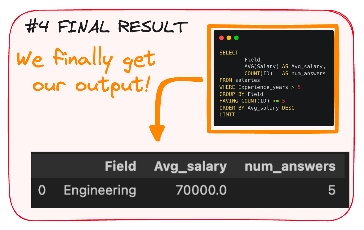
Cooking up data with SQL is like following a recipe. So let’s exemplify how it works with a simple example.
Imagine we have a table with the salary of employees depending on their field and experience.
And our goal is to understand the field that earns the most!
The query would look as follows:
Start with your data source – that's your FROM.
Then sprinkle in some WHERE to filter out the bits you don't need.
Next, stir in GROUP BY to lump similar data together - in our case by field!
Add a pinch of HAVING, keeping only the groups that fulfill your constraint.
Now, with SELECT, grab the required data - for us the field and the salary.
ORDER BY to arrange it neatly on your plate.
And LIMIT to limit our results.
And that’s it! Here we have our final result.
You can further understand SQL’s execution order in the following article.
If you prefer a cheatsheet, just go get it!
#2. Python’s simple structure
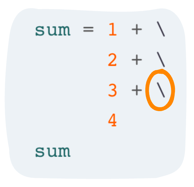
Continue lines with \
Sometimes your lines run too long. To keep it neat, we use a backslash
\to say "to be continued..." on the next line.It's the poet's elegant way of avoiding messy scrolls.
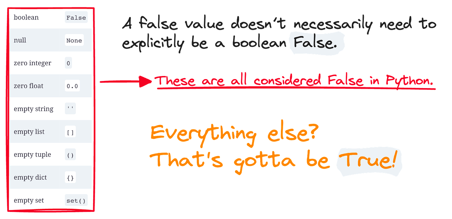
THE TRUTH ABOUT TRUTHINESS
In Python's world, truth isn't just black and white. Many things can be a "False" in disguise:
An empty list
A null string
Even the number zero!
But if it's not one of these illusionists, Python cheers "True!" by default.
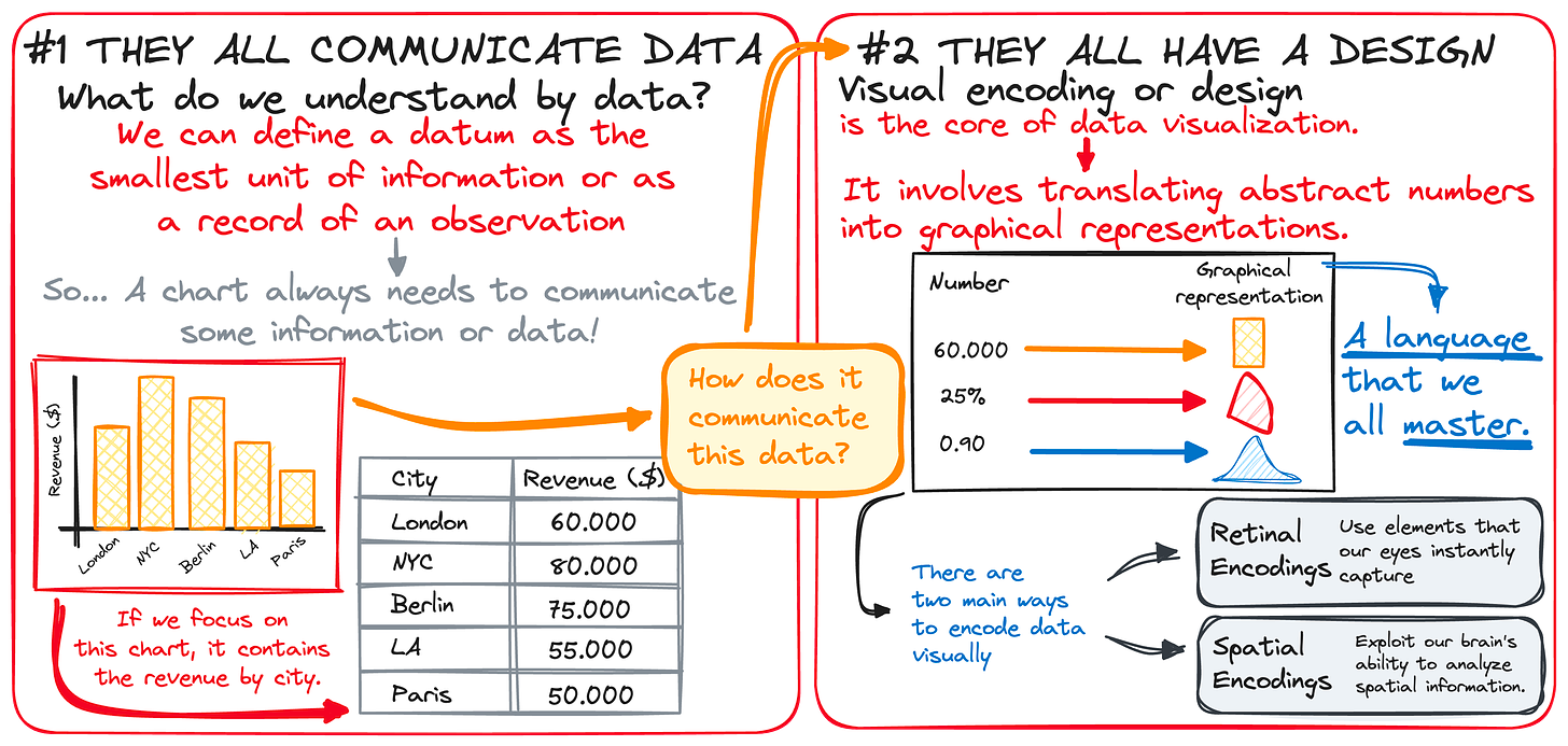
#3. Charting the Essence of Charts 🎨📊
Think of a chart as a storyteller.
Each one, from bar graphs to pie charts, try communicate tales of numbers and facts.
But what makes a chart really a chart, you ask?
It's a combo of sharing data – those tiny bits of truth – and a dash of design, giving numbers a stage to shine.
A chart translates the language of data into visuals that we all understand, no translator needed.
It's like turning a spreadsheet into a picture book that everyone, from kids to CEOs, can enjoy. So remember, a chart is where art meets data.
So next time you craft a chart, remember, you're not just a data professional.... You're a storyteller! 🤓
You can check how to implement this in the following article.
Do you prefer getting one of my cheatsheets? Here you have it!
And this is all for now!
If you have any suggestions or preferences, please comment below or message me through my social media!
Remember you can also find me in X, Threads, Medium and LinkedIn 🤓


